 skeu·o·morph [skyoo-uh-mawrf]
noun
A derivative object that retains ornamental design cues to a structure that was necessary in the original, even when not functionally necessary.
In terms of user interface, this means applications that are designed to have elements of them that look or behave like their real-world counter-parts. For example turning a digital page to resemble the experience of reading a physical book.
It is a style that Apple have been been utilizing for a long time, but lately seem to be pushing very hard. In particular on the iPad, which is a veritable smorgasbord of skeuomorphism.
This article looks at some of the most notable examples of the style, and weighs up the pros and cons. Is skeuomorphism the future of interface design?
Skeuomorphic Design In Action
Here is a round-up of what we think are some of best, most interesting or controversial examples of skeuomorphic UI in action. They are sourced from a variety of platforms, including desktop and iOS apps.
Apple iCal
This is without a doubt the hot topic at the moment when skeuomorphic design is being discussed or debated. With the release of OS X Lion, Apple decided to bring the look and feel of Calendar for the iPad to it’s desktop counter-part iCal.
Some people love it, and others hate it. But the interesting thing about this example is that it used to be different. So unlike with most designs, we actually have the simple, clean version to directly compare it to.
Propellerhead Reason
Reason 1.0 was released in 2000, and unlike most existing DAW (Digital Audio Workstations) at the time, it featured a heavily skeuomorphic interface. Not just the dials and sliders on instruments, but the whole interface emulated a hardware rack and could even be flipped over to play with the virtual cabling.
76 Synthesizer
76 Synthesizer isn’t the first app to appear on the iPad that mimics the look of classic synthesizers and other instruments. Garageband from Apple, for example does it’s fair bit of that too. But we chose 76 Synthesizer because it is arguably the prettiest app out there doing it right now.
76 Synthesizer is a joy to use, and it just wouldn’t be same without it’s realistic, textured interface. It could be argued that this is because it’s not strictly a productivity app, so a big part of it’s appeal is in it's immersiveness, and the experience of using it.
iBooks
iBooks for iOS simulates a lot of the elements of reading physical books, from the wooden bookshelf that all of your titles appear sit on, to the action of turning pages, and being able to see what’s on the next page gradually before you’ve actually completed the action, just like real books.
Apple were careful not to compromise on usability in iBooks, by allowing you to simply tap the edge of a page to turn it, rather than requiring the swiping action every time, it actually made the experience easier than turning a real page. Which is very important, especially on the iPhone version when it could potentially happen 100’s or 1000’s of times per read.
Calculator
The Calculator app for Mac and many other calculator apps, have all decided to emulate the layout of real, physical calculators. Which when you think about it, is a bit of a head-scratcher.
From a usability stand-point, there isn’t actually any reason to emulate a small digital screen, or to have big number buttons on a desktop calculator app. All desktop or laptop computers have some some kind of keyboard for inputing numbers. And it isn't any easier to click big buttons with a mouse, than use the keyboard.. so it can only come down to design for the sake of familiarity.
Dashboard
The OS X dashboard and it’s widgets are intended to provide the user with information quickly and easily, much like glancing down at the dashboard of your car whilst driving. So it’s understandable to see that the OS X dashboard is ripe with skeuomorphic designs.
Widgets resembling real world objects allows us to instantly recognise their purpose, and differentiate them from each other. We can quickly associate the yellow square as a sticky for jotting down notes, and the analogue clock for the reading the time.
The Good Points
Here is a list of what we consider to be the skeuomorphic style’s main selling points. They include the benefits of using the style, and the improvements it can make for the user experience.
- Skeuomorphic interfaces feel instantly familiar Users like the feeling of familiarity when they see a new interface. Imagine sitting in the cockpit of a plane for the first time, and trying to fly it. You probably wouldn't have much luck, but trained pilots can fly different types of plane because they are familiar with the controls.
- Visually rich and engaging When compared to a minimalist design, there are many more visual cues and treats for the eye in skeuomorphic design, and that can make for a very engaging user experience.
- Demonstrates attention to detail A well executed skeuomorphic interface, takes time and effort. And the end result usually conveys that, by the attention to detail gone into making elements look realistic, and tactile.
- Designers love any excuse to use textures There’s no shame in it, and most designers will admit that they love any chance to use textures! Unless we’re going for a minimalistic or clean look of course. There are simply very few greater satisfactions than applying a subtle leather texture to interface elements or adding 1-2% of noise to the background layer.
The Bad Points
And to balance things out, here are the drawbacks to the skeuomorphic style. The problems that can arise when using the style incorrectly or innapropriately, and the negative effects that can have on the user experience.
- Skeuomorphic interfaces sometimes hinder usability Sometimes, doing things the fun skeuomorphic way isn't always the most efficient. For example an app might require a 3 or 4 finger gesture for something that could have been achieved with a single tap.
- Shows an unwillingness to move on or innovate Insisting on keeping things familiar in designs can often slow down innovation.
Remember, Apple's tagline used to be "Think Different".
- Can result in poor use of space Skeuomorphic designs that have superfluous images or decoration are basically wasting screen real-state that for some users, especially mobile users is in short supply.
- Has the potential to look 'dated' sooner Just like in fashion. All user interfaces, no matter how modern and cool they look now, get old and become 'dated'. The problem with skeuomorphic design, is that the more out of the ordinary something looks, the quicker it starts to look old and strange.
The Alternative
Obviously there are lots of alternatives to skeuomorphic design. But in terms of modern user interface design, one style in particular jumps to mind. That is of course Microsoft’s Metro design language.
The Metro Design Principles
The design principles behind Metro are similar to those of the Swiss style and Minimalism. Basically, the content should always be the star of the show, and there shouldn’t be any superfluous graphics, text or effects. The Metro style also favours big interaction areas, rather than small buttons.
Text plays a big part in the Metro design style. It isn’t as some people believe the most important thing (we’ve established that that is the content!) but it should clean, elegant and hierarchical. Text in Metro interfaces usually utilizes size to differentiate importance.
One thing Metro definitely doesn’t condone is skeuomorphism.
Windows 8
Microsoft’s upcoming Windows release has been announced, and we can see from the consumer previews that it is heavily adopting the Metro design language.
Windows 8 is designed for both touch interaction on tablets, and phones and mouse interaction on desktops and laptops. Although the default setting is the Metro design view that can be seen in the screenshot to the right, Windows 8 will also feature the classic desktop view that current and previous versions of Windows use.
Your Thoughts & Experiences
Thanks for reading, as always we’d love to hear your thoughts! Where do you stand on the skeuomorphic front, do you love the attention to detail, familiarity, and visual treats of a good skeuomorphic design? Or do you agree with the Metro design language, and believe that content should be the focus, and eye-candy is completely unnecessary?
 .
. .
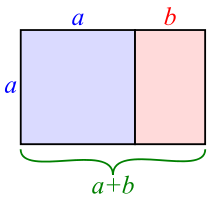
. ) is also called the golden section (Latin: sectio aurea) or golden mean.[1][2][3] Other names include extreme and mean ratio,[4] medial section, divine proportion, divine section (Latin: sectio divina), golden proportion, golden cut,[5] golden number, and mean of Phidias.[6][7][8]
 ) represents the golden ratio. Its value is:


